Top 5 Remarkable Logo Design Ideas and Trends for 2024
Your logo design is the one responsible for setting a good impression on your consumers. It should give a positive feeling to customers, present and potential, that may encourage them to know more about your brand. Remember that your logo can make or break your brand. It plays a big role in identifying your brand’s identity.
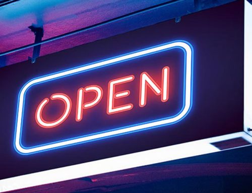
In a market setting, your shop signage will be the first thing customers will look at. The same goes with retail signage which tells your consumers more about your brand and products. Also, outdoor signs for business are popularly used to market businesses in a marketplace or shopping centre. Every signage has a logo on them, that tiny single photo should be able to tell a lot about your company.
Logos are important as attention grabbers. These tiny images should be able to capture the attention of potential customers just by simply seeing them, they should be able to create a strong first impression on anyone who sees it. Logos are also the foundation of your brand’s identity and are used to separate you from your competitors. Make sure to have a logo that is easy to recall because they are an element that should be remembered and expected by your audience.
#1: Bright and Vivid Colours
Black and white logos are a classic, sure. But today, bright and vivid colours are in and on a rampage in logo design. In 2024, say hello to brighter and more vivid logos! Keep in mind that brighter colours mean toned-down details, you can’t let elements crash.
#2: Layers
Layers in logo design are now in! It is important in a logo to have depth, texture, or create contrast. It makes the logo pop and puts it to life. These can be done by adding complementary colours, shapes, symbols, or patterns that may add “personality” to your logo.
#3: Gradients
Solid colours are what we are used to, but here’s a gradient mixing things up. Gradients elevate your logo by giving it a simple yet fun twist. Gradients used to be done using two colours that are close but now it’s levelling up, some brands actually use colours that are complementary or opposite.
#4: Font
This straight-to-the-point logo design idea is making its way to the market. Simple font logos tend to be preferable because of their simplicity and readability wherever you see them: mobile, poster, or flyer.
#5: Glitch
Last but definitely not least, the glitch effect! The glitch or motion effect gives a futuristic feel to the logo. It is ideal for businesses that want to go for a futuristic vibe kind of brand. It gives movement to the logo rather than it looking flat.
This is the Sign to Choose VIC Signs!
VIC Sign is a reliable signage company. We ensure you the best quality signage for your business.
Talk with us today and know more about the services we offer!